


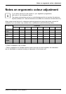
Notes on ergonomic c olo ur ad just men
t
Notes on ergonomic colour adju
stment
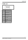
If you select colours for the monitor in your application programmes,
take note of the information below.
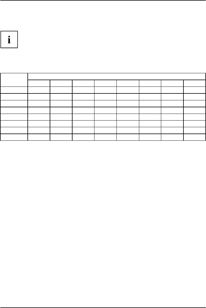
The primary colours blue and red on a dark background do not produce the minimum
required contrast of 3:1 and are therefore not suitable for continuous text and data entry.
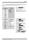
When using several colours for characters and background and giving the primary colours full
modulation, you can obtain very suitable colour combinations (see the following table):
Characters
Background
black white purple blue
cyan green
yellow red
black
++
-
+++
-
white
+++
---
+
purple
++
-----
blue
-
+
-
+
-
+
-
cyan
+
--
+
---
green
+
--
+
---
yellow
+
-
++
--
+
red
-
+
----
+
+ Colour combination very suitable
- Colour combination not suitable because colour hues a re too close together, thin characters
are not identifiable or rigorous focusing is demanded of the human eye.
A26361-K1334-Z220-1-7619, edition 1 21