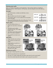
18 Evaluating laser all-in-one products
Evaluating output quality
When you evaluate output quality, avoid magnification, which can draw attention to insignificant
differences. However, careful inspection is still necessary, and when doing this, look for the following
characteristics:
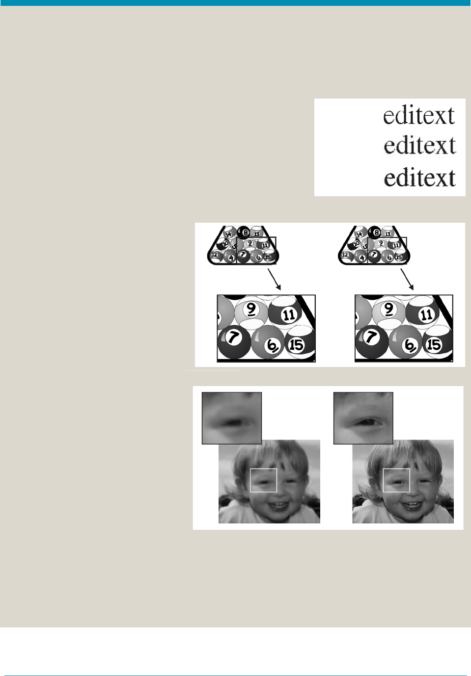
Text quality—
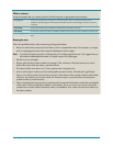
• Text should be dark, not faded, and solid black, without
hollow spots.
• Edges should be crisp and smooth, not jagged.
• There should be little or no toner scattered on the non-printed
areas of the paper.
• Reverse text should be fully visible, with no filling lines. Portrait
and landscape text should have the same print quality.
Graphics quality—
• Fine lines should be distinct, not
blending into each other or dropping
out.
• Solid black areas should be
consistent to the eye, with no lighter
shades or lines.
• Solid black areas should not appear
glossy. This reduces readability.
• There should be no bands across
graphics.
Image quality—
• Images should be clear and sharp.
• There should be no bands across
images.
• There should be no graininess or
visibility of dots.
• Gray shading should go from light to
dark in many layers, giving detail
and depth to the image.
Evaluating copy quality
Copy the type of material typical for your office.
• Does the copy quality meet your expectations?
• How easy is it to adjust image quality and select output options from the control panel?
• Does it take multiple adjustments and multiple copies to get good copy quality?
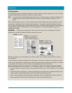
Poor image
quality
Good image
quality
Missing lines,
bad detail
Distinct lines,
good detail
Hollow spots:
Toner scatter:
Jagged edges:


