Page 38
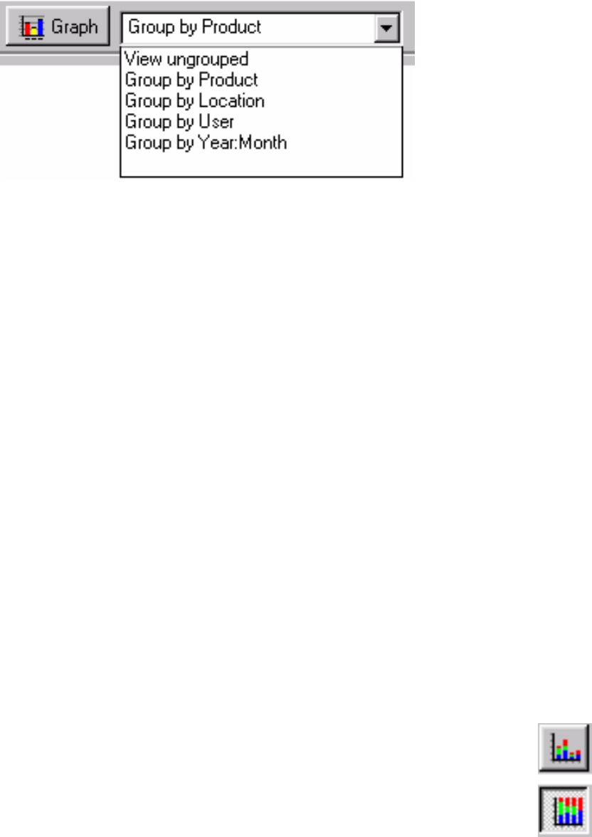
At the top of the list window is a menu, which allows you to specify how data is grouped. There are
five options:
View ungrouped Select this option to view the values in a list, which can be sorted
by any of the column headings.
Group by Product Select this option to display a separate sub-list of readings for
each product.
Group by Process/Location Select this option to display a separate sub-list of readings for
each process/location.
Group by User Select this option to display a separate sub-list of readings
performed by each user.
Group by Year:Month Select this option to display a separate sub-list of readings for
each month.
Graphing Readings
You can create a graph of the readings with the Graph button at the top of the list window (next to
the grouping menu). First choose a grouping of the data with the grouping menu, and then click the
Graph button. The graph is displayed in a new graph window. The grouping you choose affects the
units of the x-axis. For example, if you graphed readings that were grouped by process/location, the
x-axis would include all of the processes/locations in the graphed data.
You can graph a subset of the data by clicking and dragging the mouse over the data you want to
graph, or clicking on individual rows, in the list window, before clicking Graph.
Viewing a Graph
When viewing a graph, you can zoom in on a certain part of the graph by clicking and dragging a
rectangle. The area inside the rectangle you defined will enlarge to fill the window.
The Y-axis can display either numbers of readings, or alternatively, percentages. The
button in the top left of the graph view determines whether the percentages or number of
readings will be displayed on the (vertical) Y-axis. When this button is down percentages
will be displayed; otherwise numbers of readings will be displayed.


