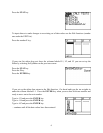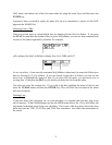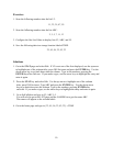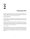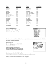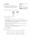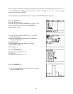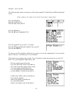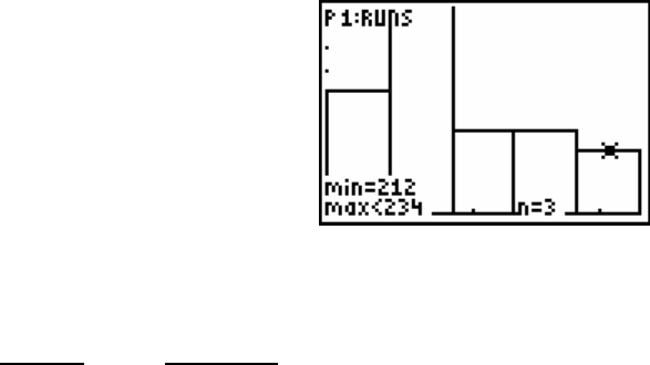
Press the GRAPH key.
Press the TRACE key.
Use the arrow keys to move from one bar to the other.
(this will supply information on the frequency in each
category and the range of values in each category).
The histogram provides us with the following information.
_Class_ Frequency
124-145 6
146-167 13
168-189 4
190-212 4
213-234 3
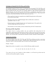
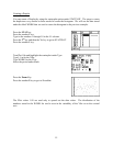
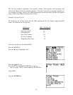
Lets review the steps for creating a histogram.
1. Enter the data into a list.
2. Determine the range of values for your data, as well as your desired class width.
3. Press the WINDOW key and set Xmin, Xmax, Xscl to the range of values and class width.
Set Ymin to 0 and Ymax to a value large enough for the tallest box in the histogram. (You
may need to come back and revise this to get it correct.)
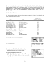
4. Press the 2
nd
key and then the Y= key to get to STAT PLOT. Make sure that at most one
plot is turned on, and select the plot.
5. Turn the plot On by pressing the ENTER key and select the third figure in the first row.
Enter the name of your data list in Xlist, and leave Freq as 1.
6. Press the GRAPH key.
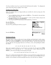
Example: Travel Time to Work
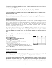
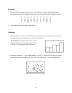
Here we have some data on average travel time (in minutes) to work for the fifty states.
22.4 18.2 23.7 19.8 26.7 23.4 23.5 22.5 24.3 26.7
24.2 19.7 27.0 21.7 17.6 17.7 22.5 23.7 21.2 29.2
26.1 22.7 21.6 21.9 23.2 16.0 16.1 22.3 24.4 28.7
19.9 31.2 22.6 15.4 22.1 19.6 21.4 23.8 21.9 21.9
15.6 22.7 23.6 20.8 21.1 25.4 24.9 25.5 20.1 17.1
13


