


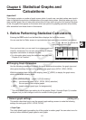
6-9
3. Calculating and Graphing Paired-Variable
Statistical Data
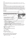
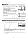
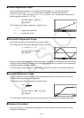
I Drawing a Scatter Diagram and xy Line Graph
The following procedure plots a scatter diagram and connects the dots to produce an xy line
graph.
1. From the Main Menu, enter the STAT mode.
2. Input the data into a list.
3. Specify Scat (scatter diagram) or
xy (xy line graph) as the graph type, and then execute the
graph operation.
Press , ) or )(QUIT) to return to the statistical data list.
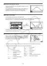
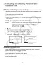
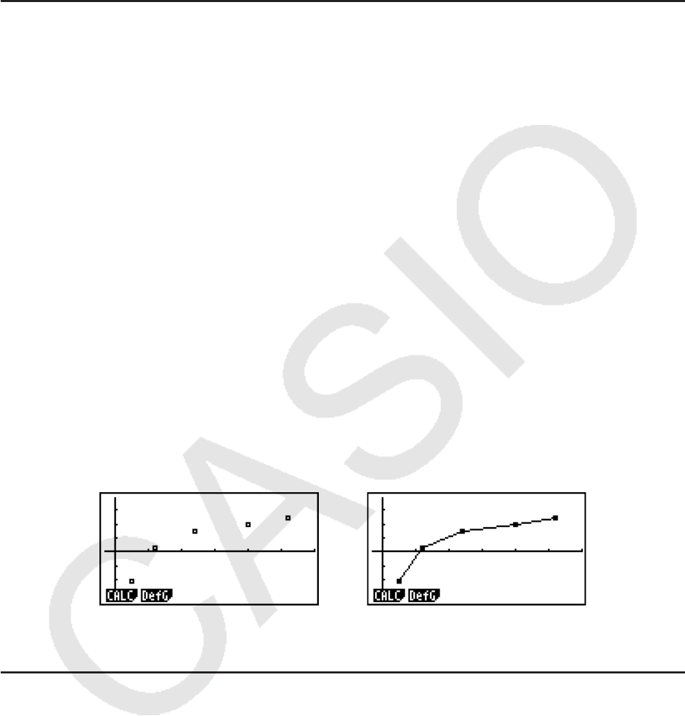
Example Input the two sets of data shown below. Next, plot the data on a scatter
diagram and connect the dots to produce an
xy line graph.
0.5, 1.2, 2.4, 4.0, 5.2 (xList)
–2.1, 0.3, 1.5, 2.0, 2.4 (
yList)
K STAT
?DU@AUACUCUDAUC
A@U?BU@DUAUACU
(Scatter diagram) (GRPH)(SET)A(Scat))(GPH1)
(
xy line graph) (GRPH)(SET)A(xy))(GPH1)
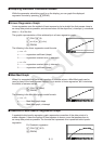
(Scatter diagram) (
xy line graph)
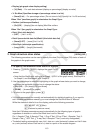
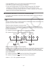
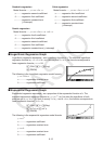
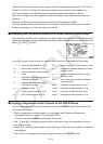
I Drawing a Regression Graph
Use the following procedure to input paired-variable statistical data, perform a regression
calculation using the data, and then graph the results.
1. From the Main Menu, enter the STAT mode.
2. Input the data into a list, and plot the scatter diagram.
3. Select the regression type, execute the calculation, and display the regression parameters.
4. Draw the regression graph.