


Chapter 8 Performance
NetAtlas Workgroup User’s Guide
98
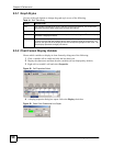
8.5.1 Graph Styles
Use one of the style buttons to change the graph style to one of the following:
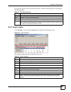
8.5.2 Chart Format Display Variable
Choose which variables to display in chart format by doing one of the following:
1 Click a variable cell in a table and click the bar chart icon.
2 Display the chart menu and then deselect variables (all are displayed by default).
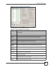
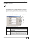
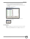
3 Right-click a variable’s cell and select Properties.
Figure 58 Cell Properties Select
4 A display properties dialog box opens. Select the Display check box.
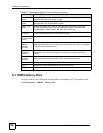
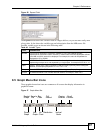
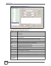
Figure 59 Chart Color Codes and Line Styles
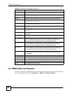
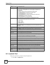
Table 41 Edit Table Entry
STYLE DESCRIPTION
Line Each variable is displayed as a line, with time as the horizontal axis. The vertical axis
represents the size of each polled value for each poll interval.
Bar The cumulative average value for each variable is displayed as a vertical bar.
Pie All variables are displayed as relative sized portions of a pie diagram. The entire display
represents a single poll interval.
Distribution Each variable is displayed as a stacked vertical bar. Each segment of the bar represents
the amount of time that the variable value is within a certain range (as a percent). The
legend on the right side of the display shows the corresponding range for each color. The
entire display represents a single poll interval.