


Introducing the Topic
In this chapter, you and your students will learn how to use the Sharp graphing
calculator to represent a one-variable data set as a histogram. Typically, a
histogram is represented on a horizontal (x) axis scaled according to the data,
with a vertical (y) axis scaled according to the data's frequency individually
(discrete) or within an interval (continuous). In each case, a bar is drawn with
its width determined by an interval on the x-axis, and its height determined by
the frequency of data within the interval.
Normally, you should seek between 5 and 7 intervals or bars; however, there
will be times you will need more or less intervals. Interval widths can be
determined logically or mathematically. Remember, the object of viewing a
histogram is to obtain or portray characteristics of the data's distribution,
therefore the number of intervals may vary.
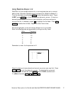
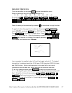
Calculator Operations
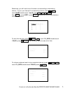
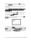
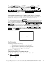
Turn the calculator on and press STAT to enter the statistics menu.
Touch A EDIT, press ENTER , to view the statistics data entry screen.
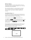
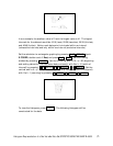
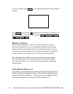
If there is a data set present within the lists on your calculator, use the
Histogram Representation of a One-Variable Data Set/STATISTICS USING THE SHARP EL-9600 11
HISTOGRAM REPRESENTATION
OF A ONE-VARIABLE DATA SET
Chapter three