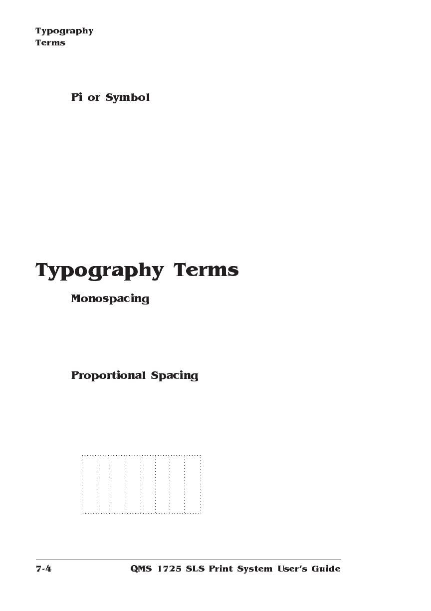
The terms “monospaced” and “fixed-pitch” refer to a typeface whose
characters all have uniform and equal spacing. These typefaces are
useful for spreadsheets and other documents with columnar data.
Monospacing is the opposite of proportional spacing.
The term “proportionally spaced” refers to a typeface in which the
width of each character varies. For example, the letter “i” is thinner
than the letter “m” and therefore takes up less space. Proportional
spacing saves page space and is easier on the eye. This manual’s
text uses the Helvetica font, a proportionally spaced typeface.
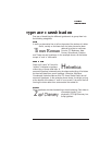
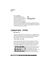
Pi or symbol typefaces are
collections of assorted special-
purpose characters (for example,
decorative, graphic, math, or
monetary characters). They are
especially useful for highlighting
Σψµβολ
items in lists, providing graphics, and displaying symbols that might
otherwise have to be drawn in by hand. Many typefaces today include
a complement of the more commonly used pi characters. Symbol and
ITC Zapf Dingbats are pi typefaces.
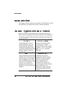
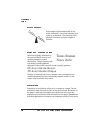
Because proportionally spaced type-
faces place each character accord-
ing to its individual size, they
increase legibility and readability.This
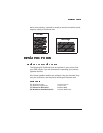
example shows the difference
between a monospaced typeface (Courier) and a typeface (Times).
alphabet
alphabet


