


Chapter 3
19 Avaya C360 SMON User Guide
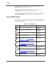
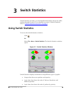
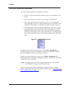
Gauges and Pie Charts in the Switch Statistics Window
The gauges at the top of the window display the following information:
The pie charts at the top of the window display the following information:
SMON updates these gauges and pie charts in real-time according to the
specified sampling interval. By viewing the relationships among these two
variables, you can learn a lot about the general behavior of the switch.
* Note: If contact with the device is lost, the graphs will display the
last data received until communications are restored.
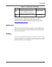
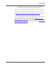
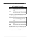
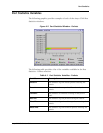
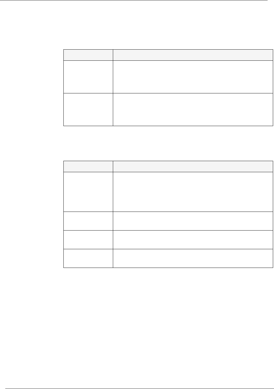
Table 3-1. Gauge Variables in Switch Statistics
Variable Description
Errors Displays the percentage of packets that contain errors going
through the device on a logarithmic scale. If this
percentage is high, this indicates that there may be a
problem.
Capacity Displays the proportion of traffic in relation to the device’s
configured capacity, as a percentage. If the capacity used
nears the device’s total capability, this indicates there may
be a problem.
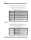
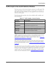
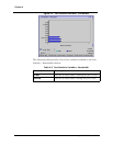
Table 3-2. Pie Chart Variables in Switch Statistics
Variable Description
Unicasts Pkts Displays the percentage of unicast packets entering the
device. On most networks, the unicast packets should
constitute the vast majority of the pie graph. If non-unicast
packets begin to increase, this indicates there may be a
problem.
Bdcsts Pkts Displays the percentage of broadcast packets entering the
device.
Mcsts Pkts Displays the percentage of multicast packets entering the
device.
Priority x
Packets
Displays the percentage of packets of priority x entering the
device, where x has a value from 0 to 7.