


USING YOUR DCP WITH A MACINTOSH
®
13 - 14
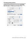
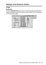
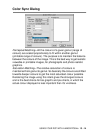
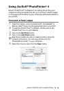
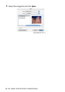
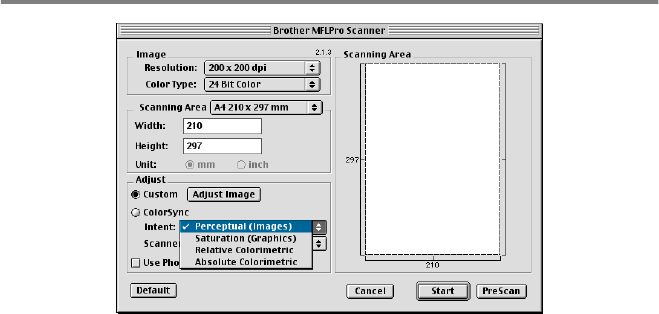
Color Sync Dialog
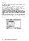
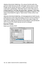
Perceptual Matching
—
All the colours of a given gamut (range of
colours) are scaled proportionally to fit within another gamut
(printable range of colours). The purpose is to maintain the balance
between the colours of the image. This is the best way to get realistic
viewable or printable images, for photographs and photo realistic
graphics.
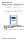
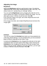
Saturation Matching
—
The relative saturation of colours is
maintained from gamut to gamut. So basically the colours are shifted
towards deeper colours to get the most saturated colour possible.
Rendering the image using this intent gives the strongest colours
and is the best choice for bar graph's and pie charts, in which the
actual colour displayed is less important than it's vividness.