


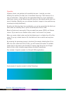
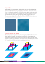

Vignettes
Vignettes, blends, and gradients (all essentially the same – basically one colour
blending into another) are often seen in documents these days. That’s because it’s so
easy to create them – simply click on the appropriate dialog box in your application,
specify your colours, and go. Blends may print poorly on some digital presses which are
prone to banding. (Banding can occur because electronic charges or toner particles may
not always be evenly distributed.)
By taking the following items into consideration, you can be assured that the blend you
want comes out smoothly when it prints on the DocuColor 2045 or 2060.
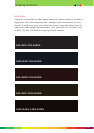
Blends will print much more easily if they are made from process (CMYK), not Pantone
colours. If you want to use a Pantone colour, select it and convert it to process.
When you create a blend, make sure that the lightest area is no lighter than 5% of the
colour. If you try to blend down to 0%, the blend won’t be as smooth and may show
banding.
By increasing the percentage change in the blend (for example, blending from 5% to
80% of a colour rather than 30% to 50%), you will increase the number of available
shades that can be used to print the blend. A narrow range forces the use of larger
bands of tints, while a broader range enhances the blend’s smoothness.
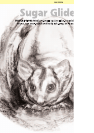
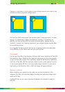
Poor example of vignette (created in a Microsoft Office application)
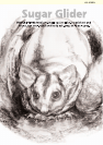
Good example of vignette (created in Adobe Photoshop)
3 - 16
DocuColor 2000 series design guide