APPENDIX
Avoiding Common Mistakes
A-4
Fonts A
Use fonts carefully. For the voice of the system and application use the bold
style of the System font in 9- or 10-point sizes. For values a user can change
use Casual 10- and 12-point. (Those are the fonts that are preset by the
system protos.)
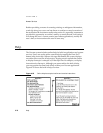
Keyboard Button A
If your application includes a Keyboard button on the status bar or at the
bottom of a slip, use the larger-size button (as in the Notepad) unless space
on the status bar is constrained (as in the Date Book). See pages 3-25 and 6-33.
Punctuation to Avoid A
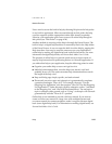
Don’t use ellipses (...) in button names, picker labels, or list-picker items. See
pages 3-4 and 4-3.
Do put an ellipsis at the end of the title or the message text in a status slip,
but use three periods rather than an ellipsis character. Also use an ellipsis to
accommodate an item whose text is too long to fit on a line in the space
available for it (for example, in overviews). See pages 2-21, 2-45, and 6-5.
Don’t use a colon at the end of a title, a heading, or a field label. See pages 2-5,
3-18, and 6-2.
Extras Drawer Icons A
To avoid overlapping icons in the Extras Drawer, make yours no more than
29 pixels tall and wide. Leaving a little space helps separate icons. See page 5-8.
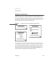
Limit the length of an Extras Drawer icon’s name to between 9 and
11 characters per line. Put a blank space in the name where you want
it to break and wrap onto another line. See page 5-9.
Make a Newton icon more distinctive and easier to identify by giving it a
distinctive silhouette rather than a boxy shape. See page 5-3.


