


CHAPTER 1
Newton and Its Users
Observe Basic Human Interface Principles 1-9
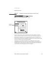
Stability 1
Personal digital assistants introduce a new level of complexity for many
people. To cope with this complexity, people need some stable reference
points. The Newton interface is designed to provide an environment that is
understandable, familiar, and predictable. It defines a number of regular
interface elements to foster a perception of stability, including view borders,
view titles, folder tabs, standard buttons, and standard button locations.
Each of these elements has a specific look and a regular, predictable behavior.
In addition, the interface defines a clear, finite set of basic data objects—text,
ink text, shapes, and sketches—and a clear, finite set of editing commands
with which users can create and manipulate the objects. Your application can
share and enhance the stability by using the regular interface elements and
handling data objects in the customary manner.
Aesthetic Integrity 1
People primarily see software as a functional product, not a fashion product.
This means you want them to notice what your product does, not how it
looks. Don’t succumb to the temptation to load up with the latest interface
fads; they’ll quickly become dated. Since people will spend a lot of time with
your product, design it to be pleasant to look at for a long time. A spare,
clean interface will stand up to repeated viewing much better than a highly
decorative interface. For example, the built-in Setup application has lots of
non-functional decorative elements to make a user’s first Newton experience
a friendly one, but the built-in applications that people use daily have none
of that decoration.
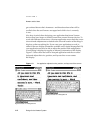
Make sure you follow the graphic language of the interface. Don’t invent
new interface elements to replace existing ones, and don’t change the
function of standard interface elements. If you change the look of standard
interface elements, people will actually try to make up functional reasons
for the differences. If you square off the corners of your buttons, use unique
view borders, or use a different symbol to designate a pop-up, people will
waste time trying to figure out what your custom elements do that the
standard ones don’t. It won’t occur to people that you merely have your own
notion of how the interface elements should look.