


10-16 Statistics aplet
To plot statistical
data
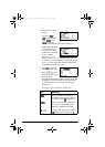
1. In Symbolic view ( ), select ( ) the data
sets you want to plot.
2. For one-variable data ( ), select the plot type in
Plot Setup (
SETUP-PLOT). Highlight STATPLOT,
press , select either Histogram or
BoxWhisker, and press .
3. For any plot, but especially for a histogram, adjust the
plotting scale and range in the Plot Setup view. If you
find histogram bars too fat or too thin, you can adjust
them by adjusting the HWIDTH setting.
4. Press . If you have not adjusted the Plot Setup
yourself, you can try select Auto Scale
.
Auto Scale can be relied upon to give a good starting
scale which can then be adjusted in the Plot Setup view.
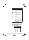
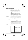
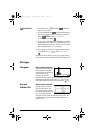
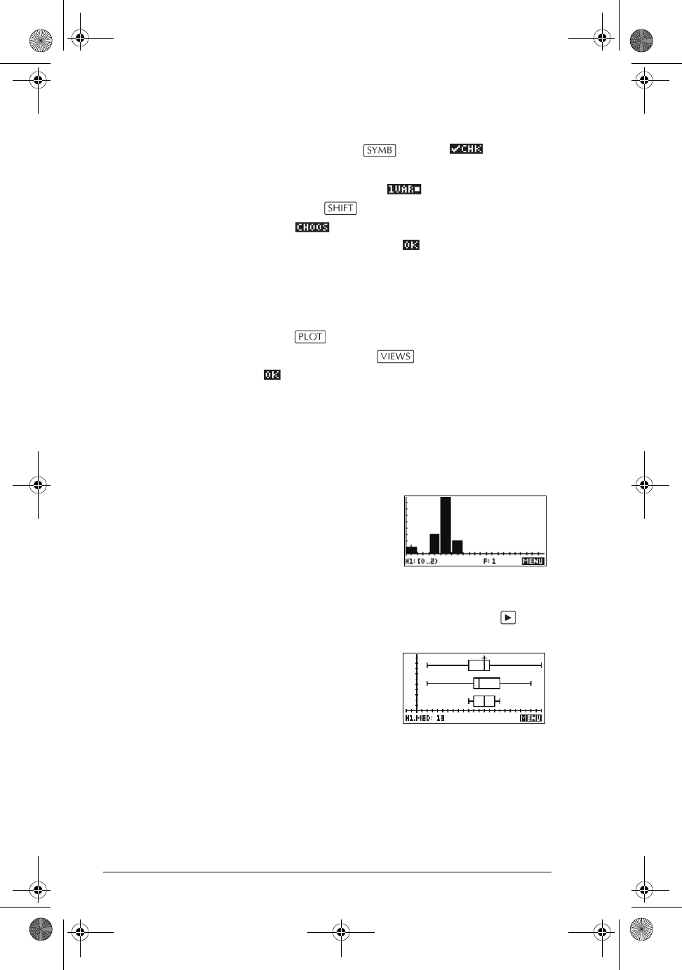
Plot types
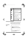
Histogram One-variable statistics.
The numbers below the plot
mean that the current bar
(where the cursor is) starts at
0 and ends at 2 (not
including 2), and the
frequency for this column, (that is, the number of data
elements that fall between 0 and 2) is 1. You can see
information about the next bar by pressing the key.
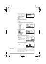
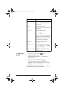
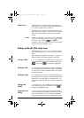
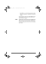
Box and
Whisker Plot
One-variable statistics.
The left whisker marks the
minimum data value. The
box marks the first quartile,
the median (where the cursor
is), and the third quartile.
The right whisker marks the maximum data value. The
numbers below the plot mean that this column has a
median of 13.
hp40g+.book Page 16 Friday, December 9, 2005 1:03 AM