C
HART
M
ANAGER
U
TILITY
7-19
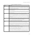
Titles Edit the names and layout of the titles that are used in the graph By typing the name into the
text field available for each title. Each graph may have a graph title, bottom title, left title and
right title. The left and right titles can be set to be read horizontally or vertically up or vertically
down by clicking the respective radio button.
Axis Set the starting point and end point of each axis to zero, variable or user defined. Zero is the
default setting for all axes.
Select the axis by clicking on the radio button in the ‘Apply to Axis’ group. To set the range
select the ‘User-Defined’ option in the scale group. The range for the axis is set by setting values
for ‘Max’ ‘Min’ in the ‘Range’ group. Set the number for marked intervals along the axis by
setting the ‘Ticks’ value.
3D 3D is only enabled when using a 3D graph. Set the view of the graph to ‘Perspective’ or
‘Isometric’. Isometric used parallel projection to view the graph and perspective uses perspective
projection, i.e. it is projected outward from a center of projection. The angle of view can be
changed by increasing and decreasing the ‘In’ and ‘Out’, ‘Up’ and ‘Down’ and ‘Left’ and ‘Right’
change bars around the graph preview in the ‘Graph Control’ window. ‘In’ and ‘Out’ is disabled
in isometric view.
Turn ‘True3D’ off by selecting the ‘Off’ radio button. This gives a static 3D view of the graph.
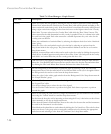
Fonts Set the font for the labels in the graph by selecting an option from the drop-down menu. Select
the style by clicking on the check-boxes ‘Italic’, ‘Bold’ and/or ‘Underline’.
The size can be changed using the ‘Smaller’ ‘Bigger’ change bar. When the ‘Smart Scale’ check
box is checked the size will be made to fit best into the graph.
Markers Change the pattern and color of each bar in the graph. First Click on the bar in the graph preview
in the ‘Graph Control’ window that you want to edit. The ‘Point’ value will change to the
number of the bar clicked. To change color or pattern select from the ‘Color’ and ‘Pattern’
drop-down menu. When the color of one bar is changed the rest of the bars turn black until they
are all assigned new colors. The pattern will take on the same color as the currently selected bar.
For graphs displaying a set of data the ‘Symbols’ group will be enabled. The symbol used in the
graph can be changed using the drop-down menu.
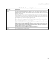
Trends Draw statistical lines by clicking on the check-boxes of the desired statistical line. Select a color
for each line from the drop-down menu opposite the check-box.
The ‘Curve Fit’ option can be changed to different types from the ‘Type’ drop-down menu. The
granularity sets the curvature of the line. High granularity means more points were used to plot
the line. Low granularity used less points to plot the line.
Line limits can be set and labeled for both high and low lines.The fill and color for the area
between these limes can also be set using the drop-down menus and clicking the ‘Fill Opposite’
check-box. If this box is unchecked then it will fill the area outside the high and low limit.
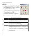
Table 7-6 Chart Manager - Graph Control
Tab Title Description


