


153
Chapter 10: Statistics & Regression Calculations
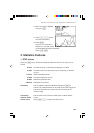
3. Graphing the statistical data
Press [ to access the statistical graphing mode.
The calculator can plot statistical data on up to 3 types of graph
(PLOT1 to PLOT3) to check the state of distribution.
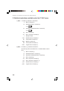
The graph types can be selected from histogram, broken line plot,
normal probability plot, normal distribution plot, box plot, modified
box plot, pie chart, scatter diagram and XY line. Broken line plot,
normal probability plot, modified box plot, scatter diagram and XY
line can use 3 different types of points — circle, cross, and
square.
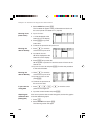
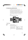
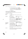
Statistical graph types overview (chart)
PLOT1
PLOT2
PLOT3
POINT:
°
POINT: +
POINT:
Histogram
Broken line plot
Normal probability plot
Normal distribution plot
Box plot
Modified box plot
Pie chart
Scatter diagram
XY line
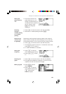
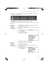
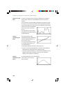
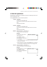
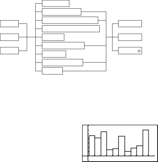
1. Graph Types
A bar graph of sample (x)
The width of the bars is set by the Xscl*.
The Y-axis shows the frequency.
* The Xscl can be changed to
between 1 and 64. Use the
Window Setting Menu to
change the Xscl. (See page
57.)
Histogram
(HIST)