


2-23
Using the Analyzer
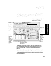
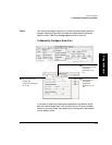
To Monitor the Link (Network)
2 Using the Analyzer
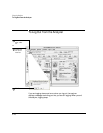
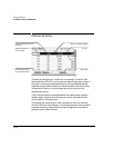
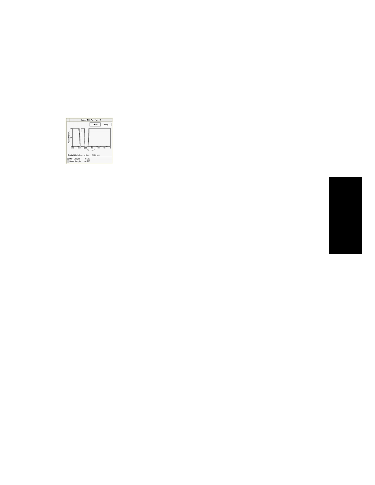
Total Mb/s Graph
The third link summary graph shows the maximum sample bandwidth
usage over time. There is a vertical indicator on the right side of the
graph. You can click the graph to move the vertical indicator to different
positions and see what the bandwidth usage was at any time during the
previous 300 seconds (5 minutes). The bandwidth usage is shown under
the graph in Mb/s.
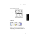
When you double-click the graph to enlarge it, the analyzer displays the
following information:
• maximum bandwidth available for the port (which is the maximum
value on the bandwidth axis for the graph)
• maximum sample bandwidth over the past 300 seconds (dark blue
line)
• mean sample bandwidth over the past 300 seconds (light blue line)
The gap between the maximum and mean sample lines is an indication of
how bursty the traffic is. The further apart the lines are the more bursty is
the traffic on the link.
At the start of each new update period (as set on the Set Measurement
Period window), the vertical indicator returns to the right side of the
graph.
Enlarged Total Mb/s
graph