


Viewing Patient Data
Trends and Calculations 8-13
Trends and
Calculations
Viewing
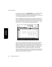
Graph
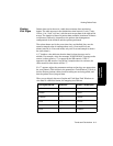
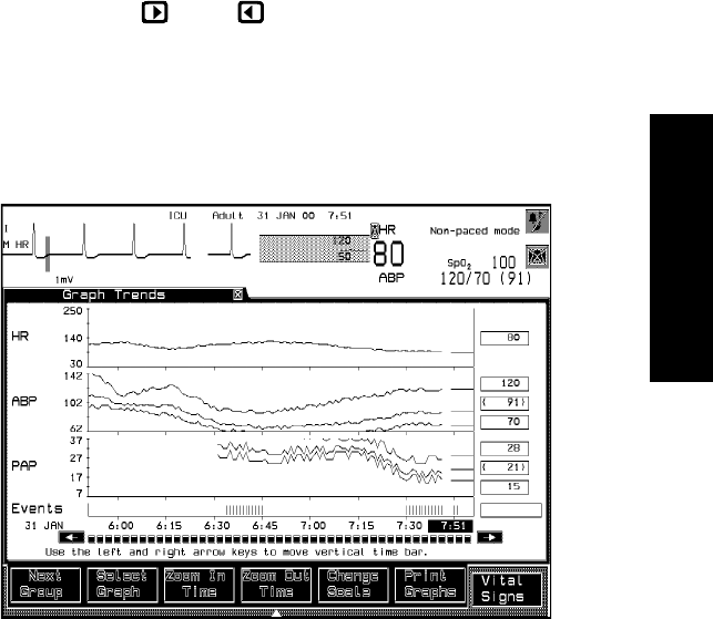
Trends
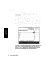
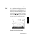
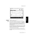
Patient data can be shown in a graph three minutes after monitoring
begins. The graph appears in the default time period with the most recent
data at the right of the screen. The times appear along the X-axis
(horizontal) in 24-hour format (for example, 18:00 means 6:00 p.m.). For
all database configurations except 9-hour, the default time period is 1, 2,
8, 16, or 24 hours. The parameter labels are listed on the Y-axis (vertical).
The number of hours of patient data available (maximum 24) depends on
the data management configuration and the options purchased.
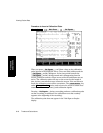
The vertical line located at the far right of the graph (when the display is
first presented) is called the time bar. This bar can be moved along the
time axis by using the and keys (these keys can be held down
to move the bar more quickly). When using a touchscreen, the arrow
buttons displayed on the screen perform the same action as the arrow
keys. To select a time directly, it is also possible to select a button
underneath that time label.
The numbers at the right of the graph indicate the time and parameter
numeric values associated with the position of the time bar.