


 Filter
 Top Products

Chapter 8: Building Desktop Applications with WPF 225
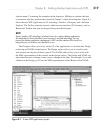
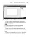
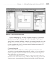
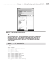
Figure 8-6 demonstrates how you can lay out a group of controls to fill an available
space. In the case of the CheckBox controls, the Orientation of the WrapPanel is set to
Vertical (the default is Horizontal). When the number of CheckBox controls fills the
vertical column, remaining CheckBoxes wrap to the next column. Because the sizes of the
CheckBox controls are the same, you have a uniform layout, which is easier than trying
to do the same thing with a Grid or other layout control. The final layout control we’ll
discuss is the Canvas, which is next.
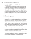
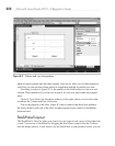
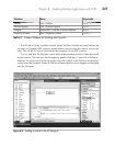
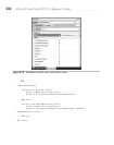
Canvas Layout
There are times when you might want to perform explicit layout of controls. If you
were building a diagramming application or a drawing program, or if you just wanted to
explicitly specify the location of controls, the Canvas layout will work fine. Figure 8-7
shows some controls on a Canvas layout.
The Rectangle and Ellipse controls were dragged and dropped from the Toolbox onto
the Canvas control. Notice the Canvas.Left, Canvas.Top, Width, and Height properties in the
Properties window, demonstrating the absolute positioning of the selected Ellipse control.
Figure 8-6 The WrapPanel Layout control