


 Filter
 Top Products

Appendix B: Introduction to XAML 413
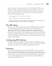
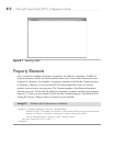
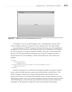
In Listing B-2, you can see that the Window has a contained Button element whose
Content attribute contains text. Figure B-2 shows what this looks like when running.
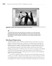
A powerful feature of XAML is property elements that allow you to add sophisticated
markup that will be assigned to a class property. In the case of the Button, we’ll enhance
the Content property as a property element in XAML to show how to add content other
than text. The following markup is the Button from Listing B-2, enhanced to hold an
image instead of text. For readability, I added a line break for the value of the Source
attribute:
<Button>
<Button.Content>
<Image Source=
"C:\Users\Public\Pictures\Sample Pictures\Penguins.jpg" />
</Button.Content>
</Button>
Instead of setting the Content attribute, the preceding example uses property element
syntax, where the child element is named <parentElementName.attributeName>. The
benefit of property element syntax shown in the preceding code is that the Content
property will now be set to an image. With attribute syntax, you were limited to text, but
with property element syntax, you can put anything in a button. Of course, instead of what
I did with the image, you would want to use common sense and only add content that is
meaningful for the application. Figure B-3 shows the new button with the image.
Figure B-2 A Button with its Content attribute set as Text