


20021201
7-4-2
Graphing Single-Variable Statistical Data
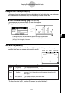
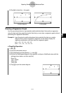
Med-Box Plot (MedBox)
This type of graph is often called a “Box and Whisker” graph. It lets you see how a large
number of data items are grouped within specific ranges.
minX Q1 Med Q3 maxX
minX minimum
DescriptionLabel Meaning
The data’s smallest value
Q1 First Quartile
The median between minX and Med.
Med Median
The median of all the data values. If you have 13 values, for
example, this is the value at position seven (six values left
and right).
Q3 Third Quartile
The median between maxX and Med.
maxX maximum
The data’s largest value
•The lines from minX to Q1, and from Q3 to maxX are called “whiskers”.
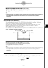
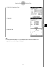
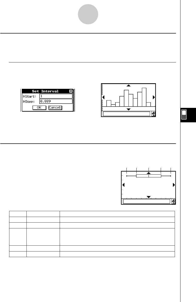
Histogram Bar Graph (Histogram)
A histogram shows the frequency (frequency distribution) of each data class as a rectangular
bar. Classes are on the horizontal axis, while frequency is on the vertical axis.
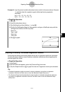
k Graph Parameter Settings (page 7-3-3, 7-3-4)
•[XList] specifies the list that contains the data to be graphed.
• [Freq] specifies the frequency of the data.
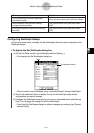
Tap [OK].
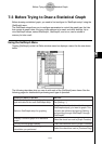
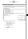
e
A dialog box like the one shown above appears before the graph is drawn.
You can use this dialog box to change the start value (HStart) and step value
(HStep) of the histogram, if you want.