


20021201
7-5 Graphing Paired-Variable Statistical Data
With paired-variable statistical data there are two values for each data item. An example of
paired-variable statistical data would be the change in size of an iron bar as its temperature
changes. One variable would be temperature, and the other variable is the corresponding
bar size. Your ClassPad lets you produce any of the graphs described in this section using
paired-variable data.
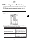
Before trying to draw any of the graphs described below, configure the graph setup using the
procedures under “Configuring StatGraph Setups” on page 7-3-2.
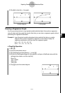
Drawing a Scatter Plot and xy Line Graph
Use the procedure below to plot a scatter diagram and then connect the dots to produce an
xy line graph.
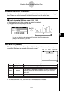
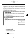
Example: Input the paired-variable data shown below. Next, plot the data on a scatter
diagram and then connect the dots to produce an xy line graph.
list1 = 0.5, 1.2, 2.4, 4.0, 5.2
list2 = –2.1, 0.3, 1.5, 2.0, 2.4
u ClassPad Operation
(1) m I
(2) Input the data shown above.
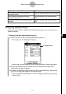
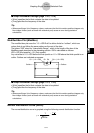
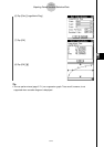
(3) Tap [SetGraph] and then [Setting…], or tap G.
(4) On the Set StatGraphs dialog box that appears, configure a StatGraph setup with the
scatter plot settings shown below, and then tap [Set].
Draw: On
Type: Scatter
XList: list1
YList: list2
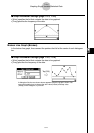
(5) Tap y to plot the scatter plot.
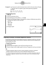
(6) Tap the List window to make it active.
(7) Tap [SetGraph] and then [Setting…], or tap G.
(8) On the Set StatGraphs dialog box that appears, configure a StatGraph setup with the
xy line graph settings shown below, and then tap [Set].
Draw: On
Type: xyLine
XList: list1
YList: list2
7-5-1
Graphing Paired-Variable Statistical Data