


Parameter Description
device types.
l Microwave
(This option is only available for 2.4 GHz radios)
l Bluetooth
(This option is only available for 2.4 GHz radios)
l Fixed Freq (Others)
l Fixed Freq (Cordless Phones)
l Fixed Freq (Video)
l Fixed Freq (Audio)
l Freq Hopper (Others)
l Freq Hopper (Cordless Network)
l Freq Hopper (Cordless Base)
l Freq Hopper Xbox
(This option is only available for 2.4 GHz radios)
l Microwave (Inverter)
(This option is only available for 2.4 GHz radios)
l Generic Interferer
For more information on non-Wi-Fi device types detected by a spectrum monitor, see "Working with
Non-Wi-Fi Interferers " on page 606.
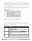
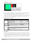
Channel Range For graphs created by spectrum monitors, specify a channel range to determine which channels
appear in this graph. Click the first drop-down list to select the lowest channel in the range, then
click the second drop-down list to select the highest channel to appear in the graph.
By default, this graph displays all channels within the spectrum monitor’s radio band.
NOTE: This parameter is not configurable for graphs created by hybrid APs.
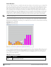
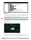
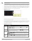
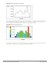
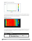
Quality Spectrogram
This plot shows the channel quality statistics for selected range of channels or frequencies. This chart can also be
configured to show channel availability, the percentage of each channel that is unused and available for additional
traffic.
Channel Quality is a weighted metric derived from key parameters which include noise, non-Wi-Fi (interferer)
utilization and duty-cycles and certain types of retries. Quality levels are indicated by a range of colors between dark
blue, which represents a higher channel quality, and red, which represents a lower channel quality. Channel
availability is indicated by a range of colors between dark blue, which represents 100% channel availability, and red,
which represents 0% availability.
NOTE: For additional information on interpreting a Dell Spectrogram plot, see "Swept Spectrogram" on page 603.
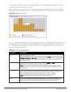
The Spectrum Analysis Quality Spectrogram chart measures channel data each second, so after every 5-second sweep,
the newest data appears as a thin colored line on the bottom of the chart. Older data is pushed up higher on the
chart until it reaches the top of the spectrogram and ages out. The example below shows the Dell Quality
Spectrogram chart after it has recorded over 1500 seconds of FFT data.
DellPowerConnectW-SeriesArubaOS6.2 | User Guide Spectrum Analysis | 600