


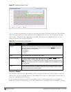

603 | Spectrum Analysis DellPowerConnectW-SeriesArubaOS6.2 | User Guide
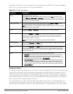
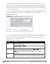
Parameter Description
NOTE: This parameter is not configurable for graphs created by hybrid APs.
Center
Frequency
If you selected Frequency in the X-Axis parameter, enter the frequency, in MHz, that you want to appear in
the center of the x-axis of this chart.
Span If you selected Frequency in the X-Axis parameter, specify the size of the range of frequencies around the
selected center frequency. If you set a frequency span of 100 MHz, for example, the chart shows the FFT
duty cycle for a range of frequencies from 50MHz lower to 50 MHz higher than the selected center.
Y-axis Select the range of power levels, in -dBm, to appear in the y-axis of this chart. Enter the lower value in the
right field, and the higher value in the left field.
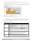
Show Select the checkbox by the following items to display that information on the FFT Power chart.
l Average: The average power level of all samples recorded during the last 10 sweeps.
l Max: The highest power recorded during the last 10 channel sweeps.
l Max Hold: The highest maximum power level recorded since the chart data was reset. To clear this
setting, click the down arrow at the end of the title bar for this graph and select Clear Max Hold.
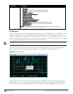
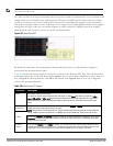
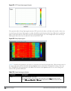
Swept Spectrogram
A spectrogram is a chart that shows how the density of the quantity being plotted varies with time. The spectrum
analysis Swept Spectrogram chart plots real-time FFT Maximums, real-time FFT Averages or the FFT Duty Cycle.
In this swept spectrogram, the x-axis represents frequency or channel and the y-axis represents time. Each line in the
swept spectrogram corresponds to the data displayed in the Real-Time FFT or FFT Duty Cycle chart.
NOTE: This chart is not available for W-AP120 Series or W-AP68 access points. A hybrid AP on a 20 MHz channel will see 40 MHz
Wi-Fi data as non-Wi-Fi data.
The power or duty cycle values recorded in each sweep are mapped to a range of colors. In the average or maximum
FFT power Swept Spectrogram charts, the signal strength levels are indicated by a range of colors between dark blue,
which represents -90 dBm, and red, which represents a higher -50 dBm. The duty cycle Swept Spectrogram chart
shows the percentage of the time tick interval that the selected channel or frequency was broadcasting a signal.
These percentages are indicated by a range of colors between dark blue, which represents a duty cycle of 0% percent,
and red, which represents a duty cycle of 100%.
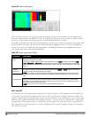
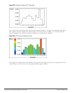
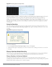
A spectrogram plot is a complex chart that can display a lot of information. If you are not familiar with these types
of charts, they may be difficult to interpret. The following illustrations can help explain how FFT power data is
rendered in a spectrogram format.
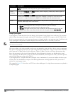
The example in Figure 229 shows how an FFT Power chart could appear if a single data measurement was plotted as
a simple line graph.